Introduction
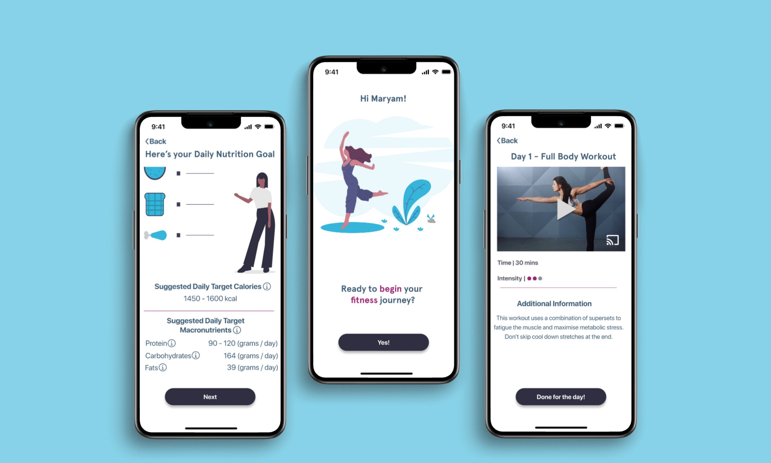
A beginner friendly fitness app for those who are always beginning!
Project Overview
Remember the time when you entered a gym and all around were the pros lifting 1000 kgs. You tried to pick up a dumbbell but the intimidating sound of the weights hitting the ground made you go like, “maybe another time” and you left.
If your answer is yes, you have come to the right place! Pull your weight is for the individuals who are beginning their fitness journey and have no idea where to start from. It is also for those who have tried it several times but the generic diet plans and workout routines do not seem to work; hence, no adherence!
Project Type
Independent academic capstone project for UX Diploma at BrainStation
Duration
Eight weeks
Tool and Platform
Figma / iOS
Walkthrough
Problem Space
Why are individuals not able to adhere to a fitness regime? Why or why not fitness trainers? Is there an alternative to fitness trainers?
What inspired Pull Your Weight?
SPOILER ALERT: IT WAS A PERSONAL STRUGGLE!
The idea came out when I decided to pull my life together and finally start my fitness journey - for the nth time this year. But where to begin? The fitness trainers are just out of my financial league and while good friend google has abundance of information, who has time to sit down to sieve through information and plan a regime which works. Furthermore, generic fitness plans only work for a while.
This story led me to research about low cost ways of adhering to a fitness regime and eventually helped me to create pull your weight.
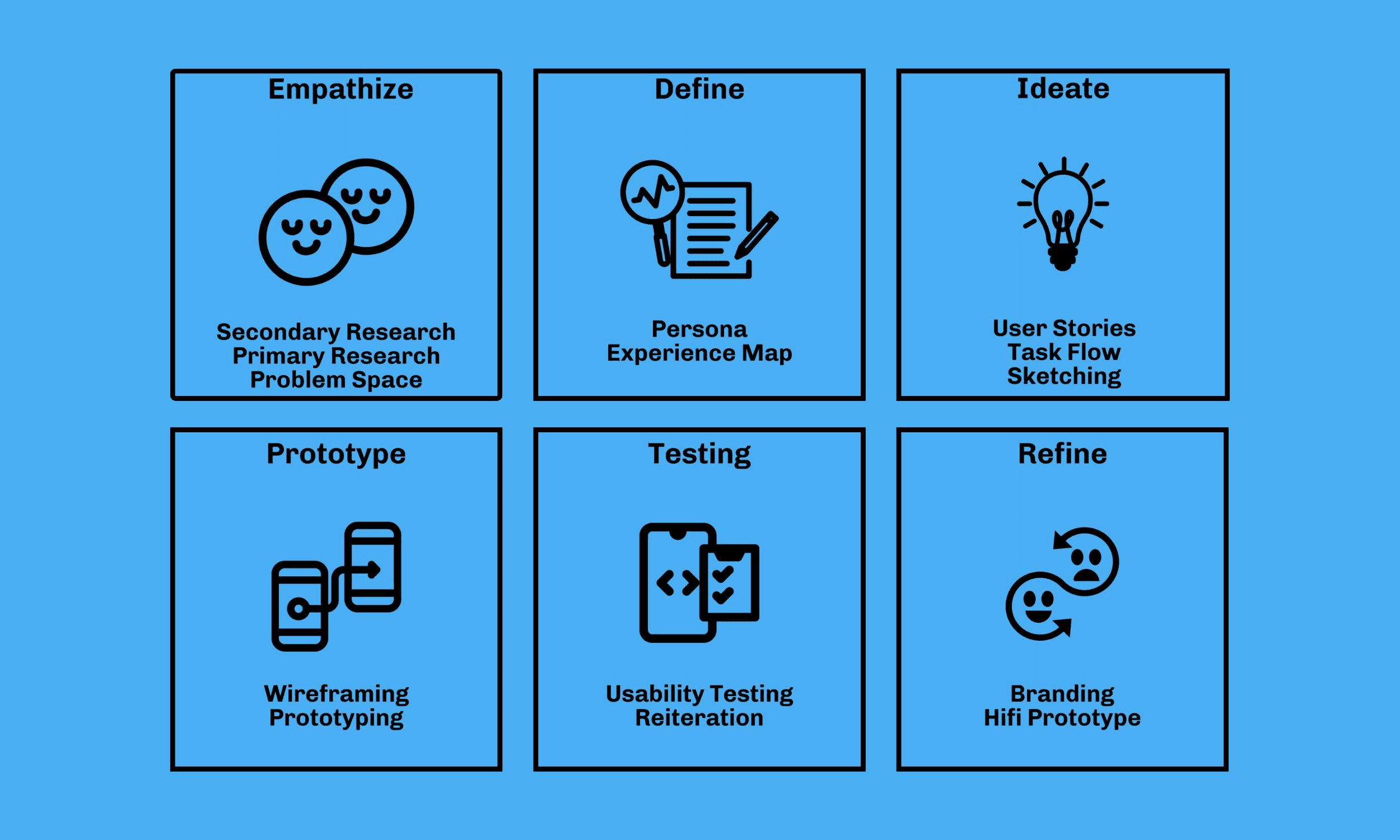
Methodology
Secondary Research
People who are new to fitness world and want to lose weight to reach their fitness goals, often find it hard to begin their journey, even when they may have access to the space where they could train and/or gym equipment. One way of getting started is through the Personal Trainers. They help with learning all the essential exercises, correct forms, nutritional guides and accountability.
However, hiring a Personal Trainer is expensive. The average cost of personal trainers is $50-$65 per session. In addition to this, beginners also find themselves intimidated by the idea of working out on the complicated machines, while the Personal Trainers prefer body weights for their own work out. Such drastic change in the approaches also make the beginners question the credibility of the Personal Trainers.
Furthermore, while there are several YouTube channels, TikTok influencers, and fitness apps, they are not always helpful as plethora of information often becomes overwhelming for the beginners. Also, they are not geared towards the individual’s needs (body type, current BMI / weight, lifestyle etc.) and hence, beginners end up with random workouts and diet plans. Hence, when they don’t see the desired results, they give up.
Research Objectives
To find cheaper ways for the beginners to start their fitness regime
Interview Insights
I reached out to three individuals for interview, based on the following criteria:
Relatively new to fitness regime and does not have a fitness trainer
Student / employed and has a time constraint
Someone who may have tried a fitness regime but keep failing to adhere

There are so many online options that it is exhausting to do the research and make a plan. By the time I actually have a plan to work towards my goal, I feel burnt out and just give up on the idea of losing weight and being healthy.
- Hunain Ali, 38
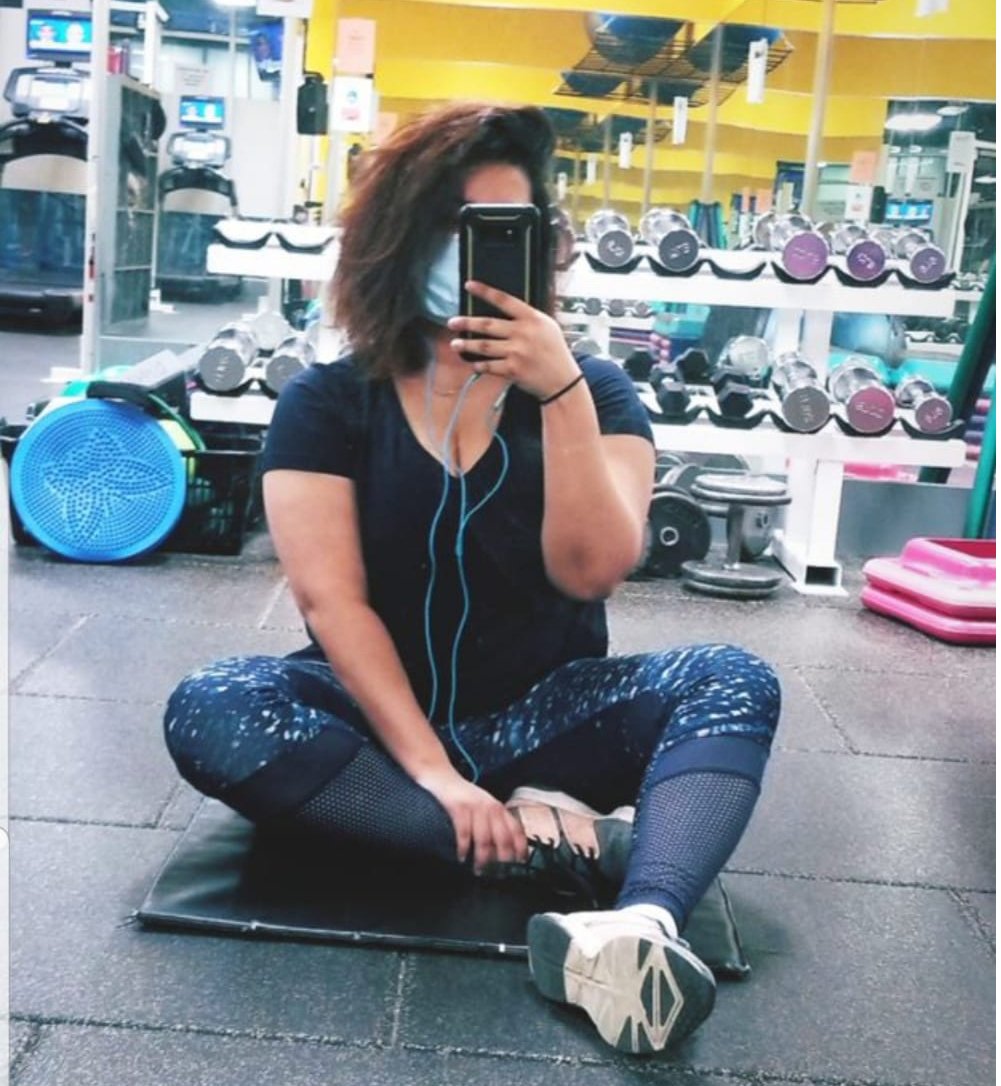
As someone who struggles with adhering to a fitness routine, I see benefit of having a Personal Trainer. I wish I had access to lifetime FREE membership with a personal trainer so that I wouldn’t have to struggle with accountability and having to relearn about fitness every time I started my journey.
- Ahana Roy, 28
How might we…
With the interview insights, I had more clarity about the problem space. The findings helped me draft the following HMW:
HOW MIGHT WE EMPOWER BEGINNERS WITH THE RESOURCES NEEDED TO ACHIEVE THEIR FITNESS GOAL?
Persona
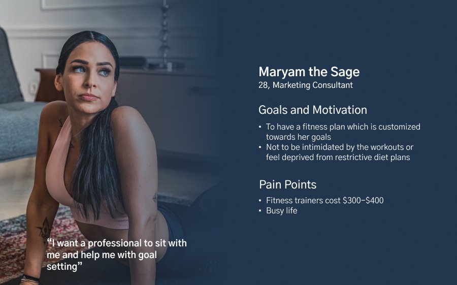
Experience Map
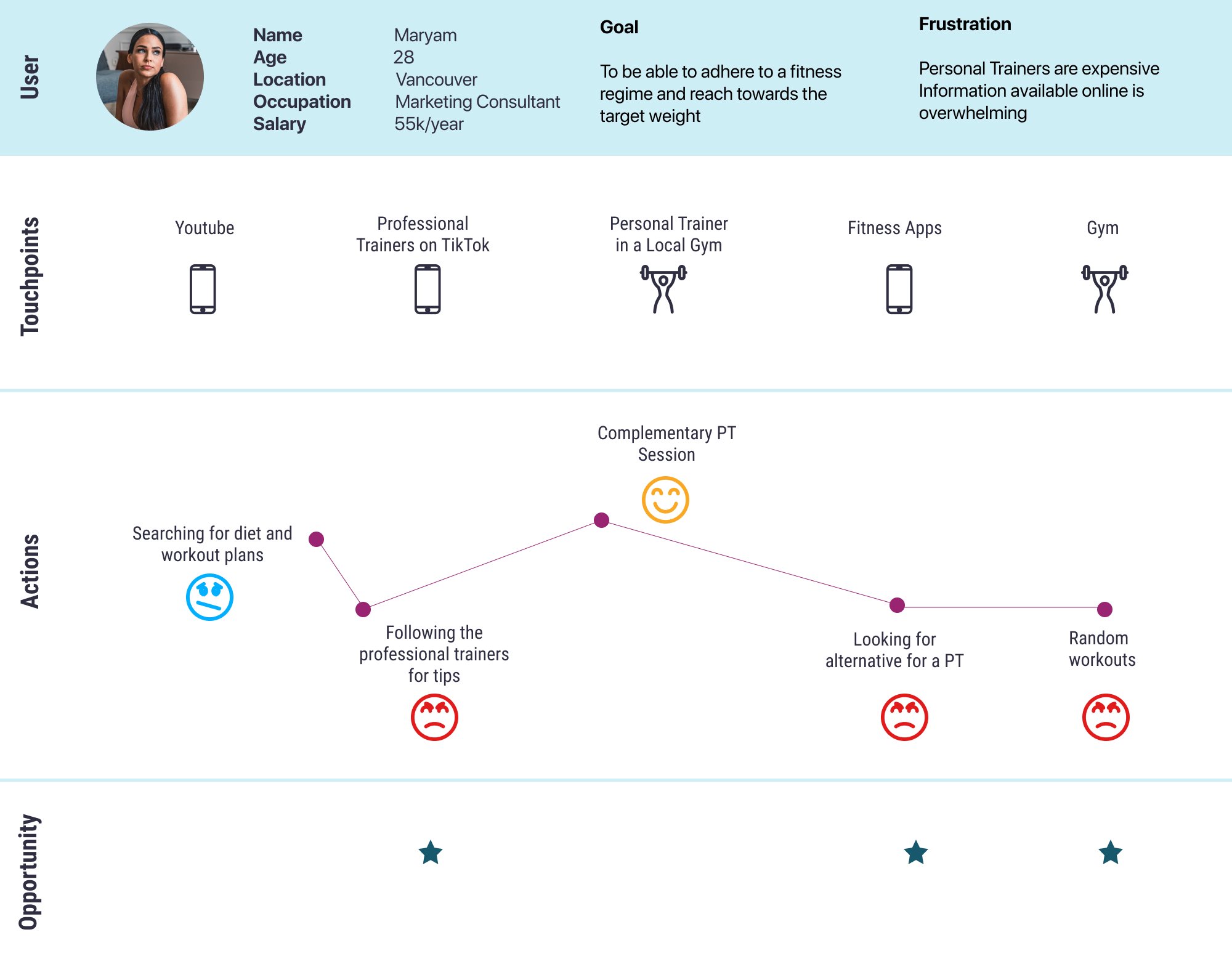
Early Insights
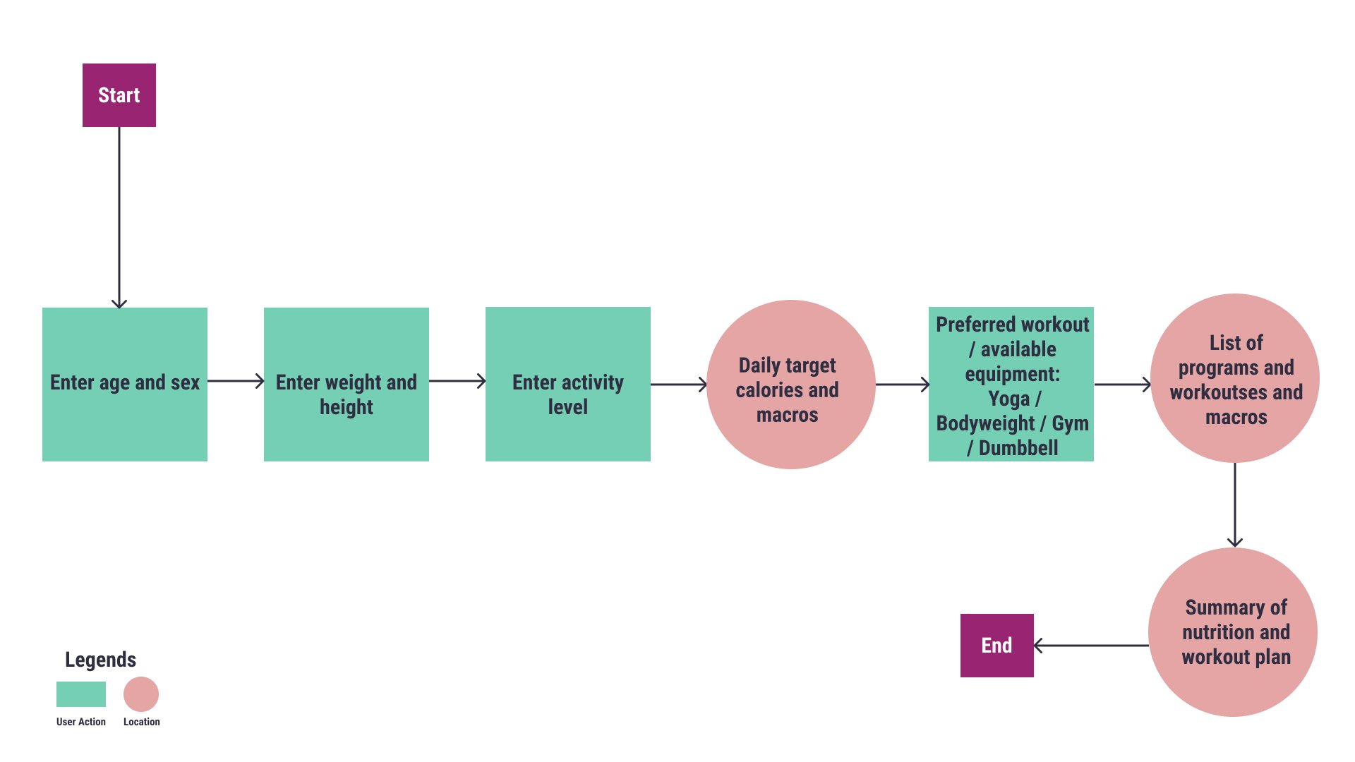
While I started working on the task flow diagram, this solution started to appear more practical for a busy life style. I envisaged a digital platform, which Maryam could carry with her on phone and take it to the gym or her workout space. All she would have to do is look at her screen and follow the instructions. Furthermore, as it is famously said that “80% abs are made in the kitchen” I wanted to integrate nutrition guide as well as part of the holistic experience. So I chose a nonrestrictive nutrition guideline which would be easy to follow and track.
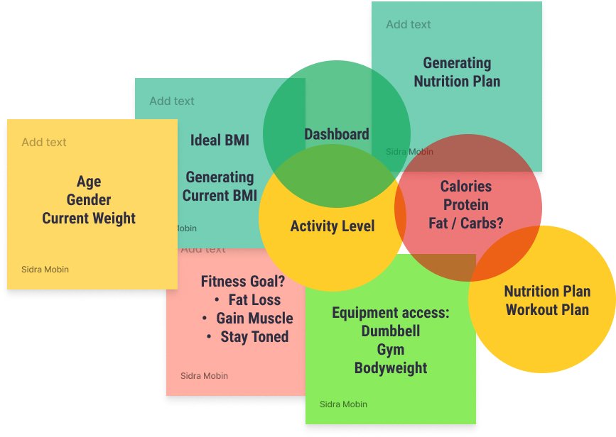
Before diving in the design process, I identified some of the key elements to use in the task flow which would make Maryam a very happy user! These key elements were derived from the user stories and the epic. At the inception, I considered the factors and the inputs which would generate a customize fitness regime. I was able to find this information through the fitness trainer that I personally follow, Physiqnomics and a certified physician specialized in obesity, Dr. Spencer Nadolsky (docs who lift).
Task Flow Diagram
Competitive Analysis
Combining the features of the apps on the App store and the features that this project focuses on, I did a quick competitive analysis. I picked 5 top rating apps with similar goals and analyzed on 5 features, as shown below.
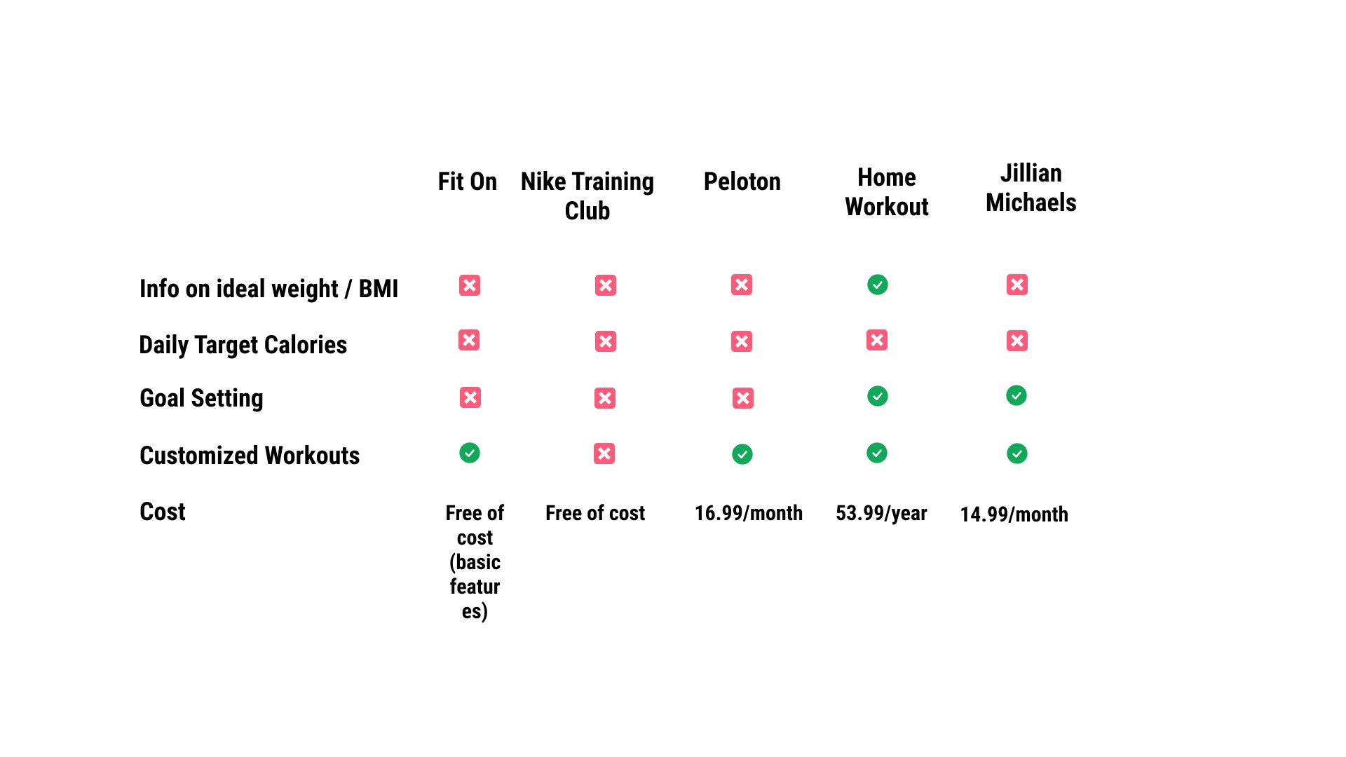
Competitive Analysis Findings
The competitive analysis helped me identify the niche market that my digital product will be catering:
The beginners who need help with goal setting. Based on users’ goals and current fitness level, generating a fitness plan which they know will work; hence, adherence to the plan!
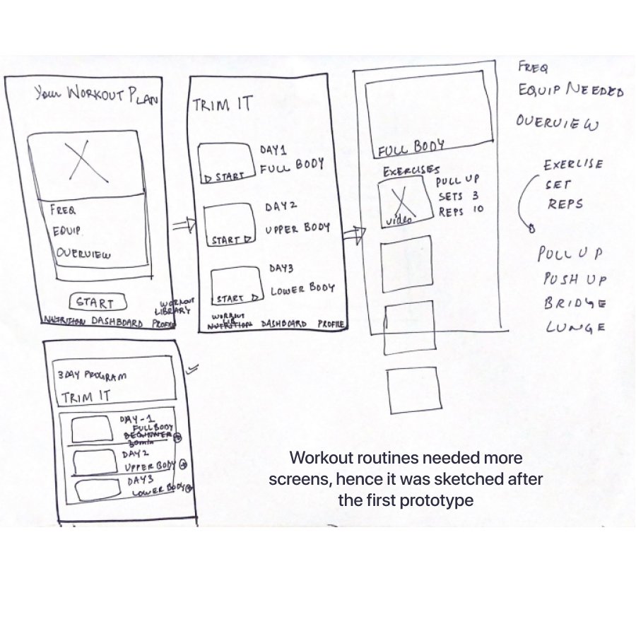
Sketches
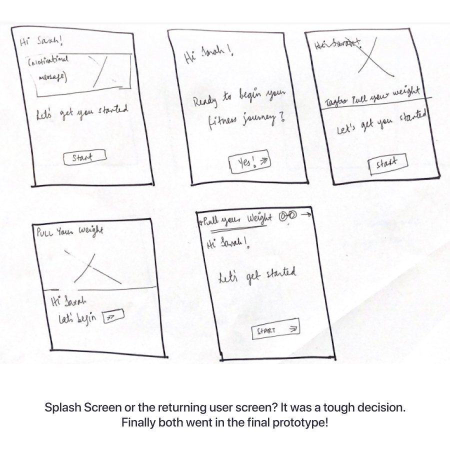
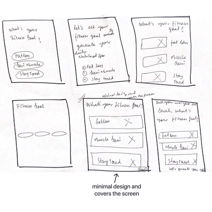
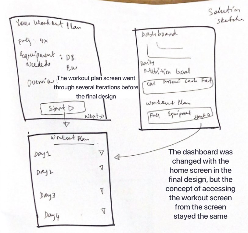
Usability Testing - Round 1
The first prototype of the app turned out to be basic and with several design issues, some of which were addressed after the first round of user testing. The first round of the testing was consisted of 5 testers.
The testers also pointed out some usability issues. A prioritization matrix was created to identify low effort and high impact changes. Due to time constraint, I focused on the low effort changes, and marked others to integrate at a later stage. Some of the changes are shown below:
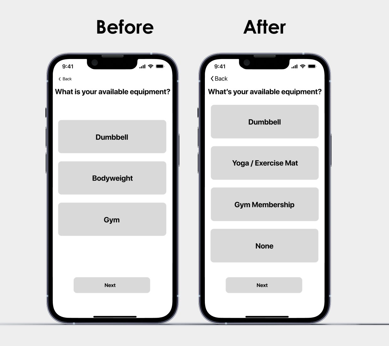
One of the 5 testers commented that a user may not have an equipment available and adding “none” as an option seems inclusive. It was a low impact design change, hence added on the screen.
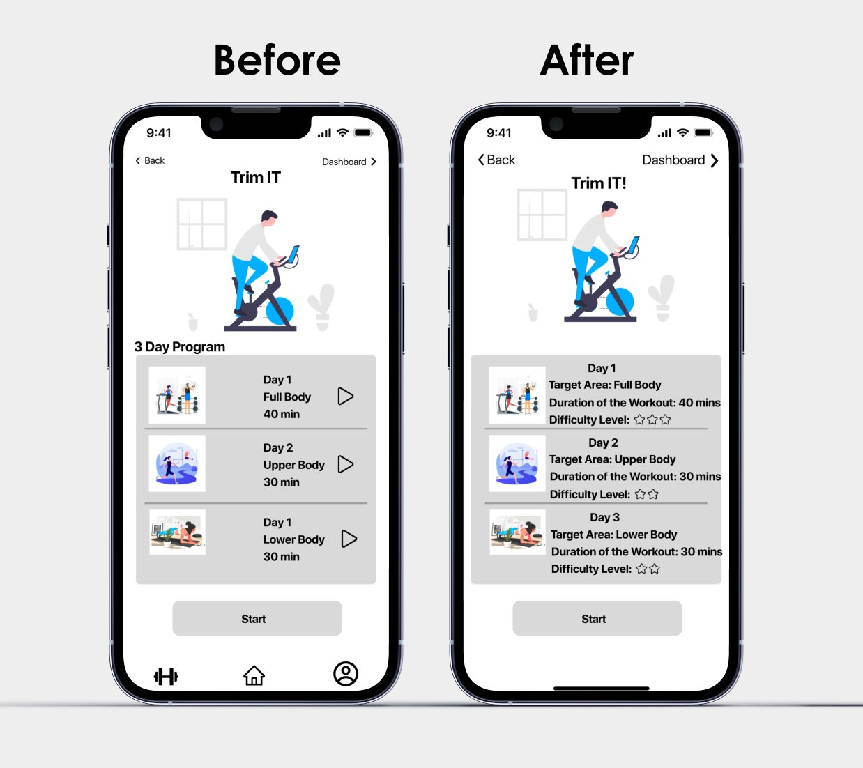
3 out of 5 testers commented that it would be nice to have information about the difficulty level on each screen. Furthermore, without explanation, it wasn’t clear what each term meant.
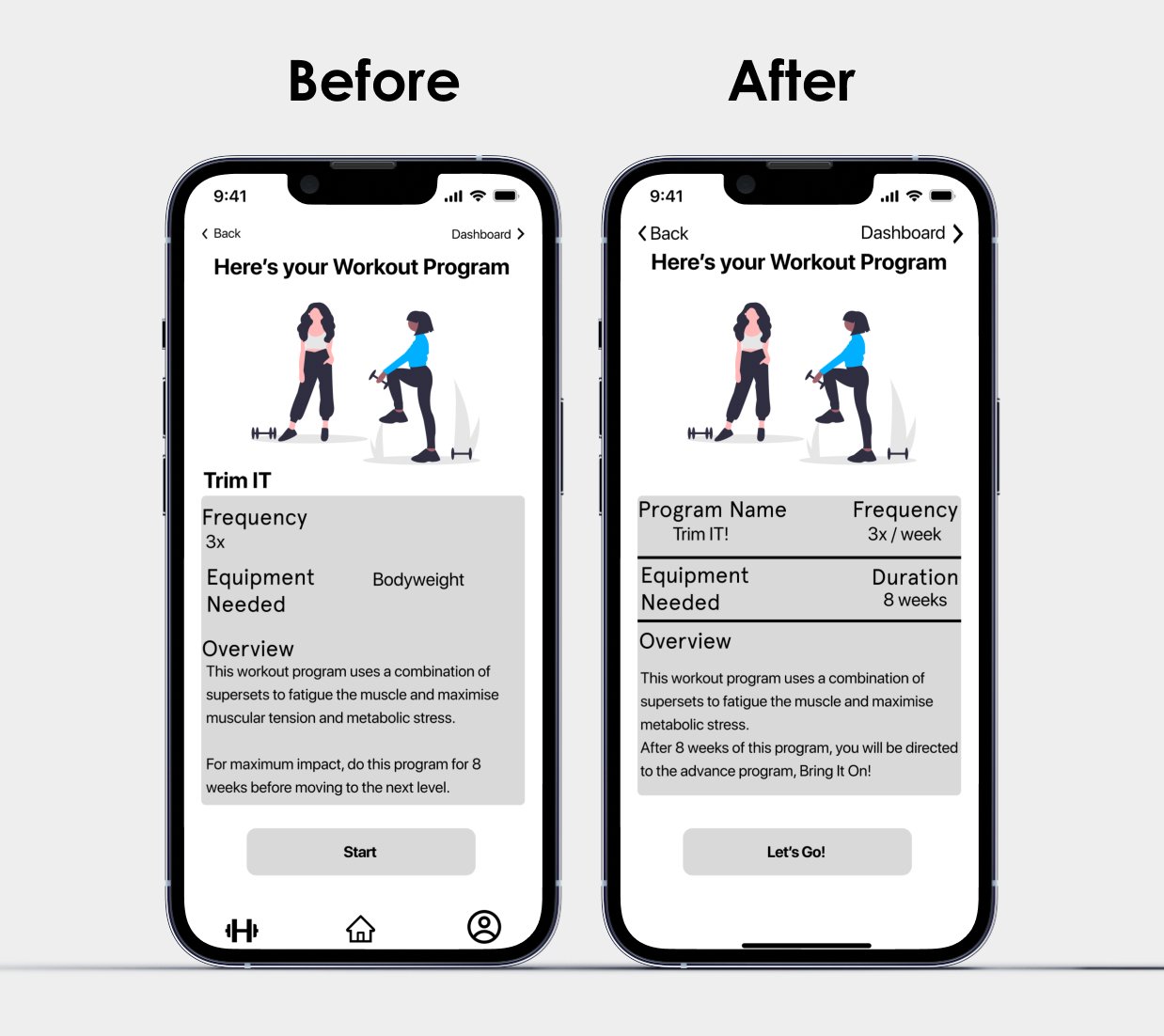
This screen is full of information. The layout had readability issues and also at some places the copy was hard to understand.
Usability Testing - Round 2
Overwhelming number of responses suggested a screen showing the completion of the task, after the Day 1 of the workout. There were several other design change recommendations and using the design priority matrix, I once again decided to go with the low effort and high impact changes.
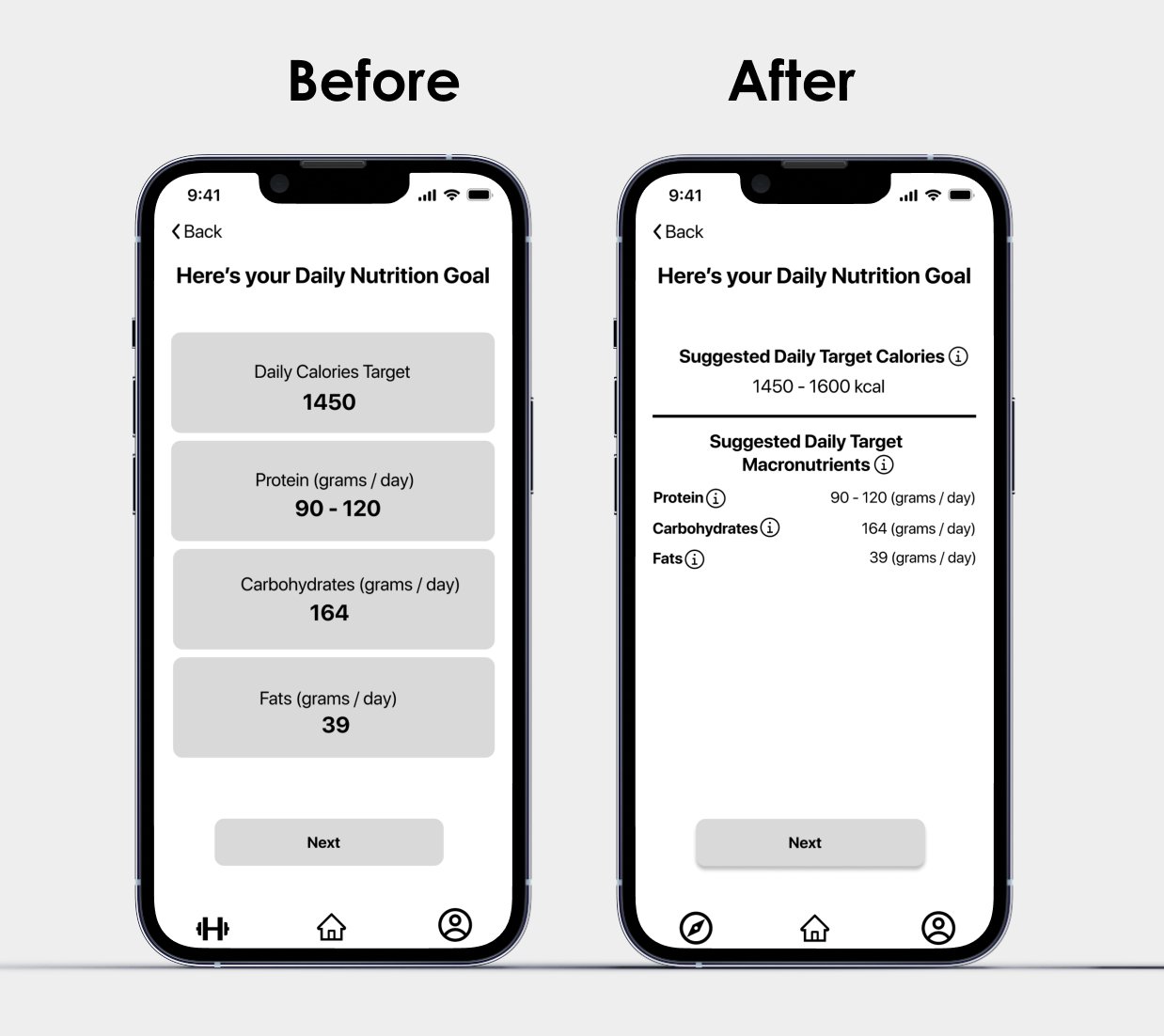
The grey blocks seemed like buttons and also for a beginner, these numbers may mean nothing. Hence, a simplified design was created with overlay feature to explain different terminologies on the screen.
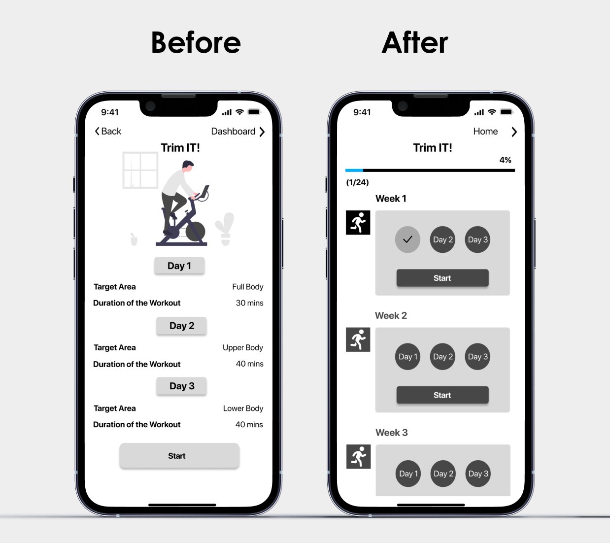
Both of these screens are addition in this version. The idea was to show that Day 1 of the workout has been completed, in a simple way. A progress bar was also added to keep the user motivated and give an overall sense of accomplishment.
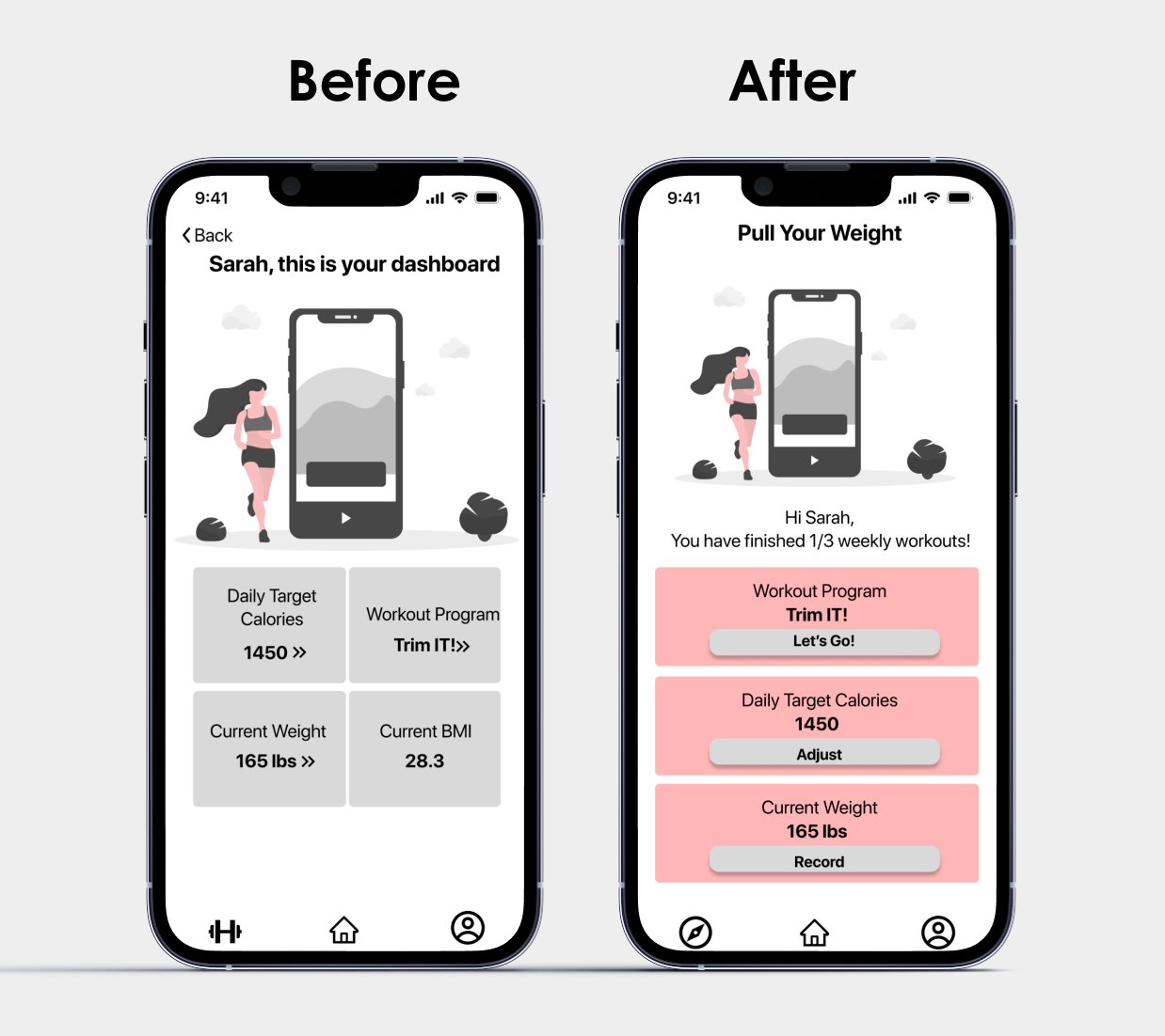
There were different feedbacks and expectations with the dashboard. However, one tester suggested that for future reference, it may be a good idea to replace the dashboard with a home screen. This recommendation turned out to be useful when later I designed the alternative platform.
Brand Identity
REASSURING, CALM, FRIENDLY, MORE FUNNY THAN EDGY. THINK ABOUT CUTE HELPFUL THINGS, WHICH MAY SEEM TRIVIAL BUT HOLD A LOT OF VALUE AND WARMTH

Color Palette
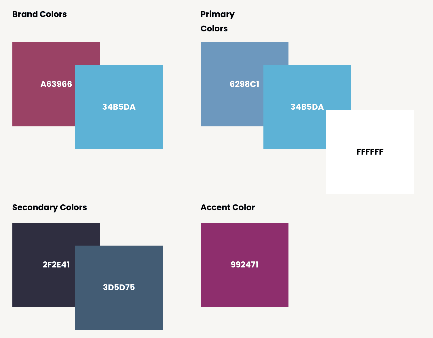
After multiple rounds of color injections to the final screens and numerous feedbacks, a color palette was finalized, which included brand colors. For my color palette, I wanted to use 60:30:10 rule as well as wanted to make sure it is accessibility compliant.
Typography
For the typography, like the overall mood of the app, I wanted to go with a light comical feel without making it look childish. The headings on the app are inspired by the app, “headspace” which very tastefully uses illustrations. For the rest body text, I preferred the system font for iOS.
Wordmark
I wanted to experiment with the dumbbell icons on the wordmark; however, it didn’t turn out to be as neat as I had envisioned. Finally the inspiration of the wordmark came from “Discord”.
The Big Reveal
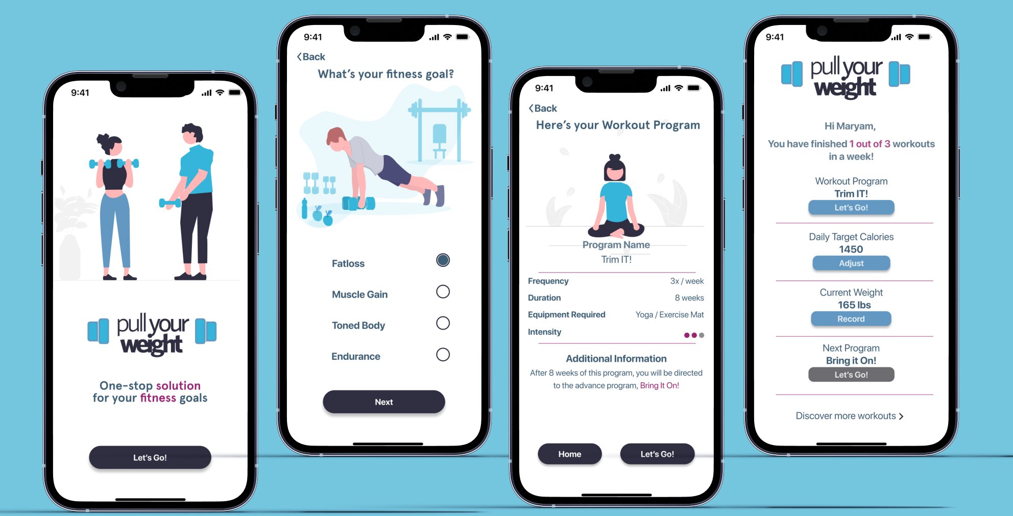
Experts say that you can never be satisfied with your design, thankfully project submission deadlines made this designer put a full stop. The final prototype was a result of several iterations, resulting in a slight design change to make it visually pleasant.
Key Learnings
The power of asking the right questions!
As a UX researcher it is imperative to be able to wear the curiosity hat and look for the answers at every phase.
Keep an open mind
The design process is full of wonderful surprises! Keep asking for feedback from peers and know that improvement is an ongoing process.
What’s next?
Improved Features
During the user testing, there were suggestions which were high effort and high impact, mostly related to functional features of the home screen. It would be great to be able to implement the feature to record users’ target weight and update the calories intake.
Community
The other epic which emerged during authoring of the user stories was motivation. Fitness journey can be a lonely journey and a buddy to keep you motivated helps the process. An online community accessible through app could be effective in addressing motivational issues.
